Reva Hirave
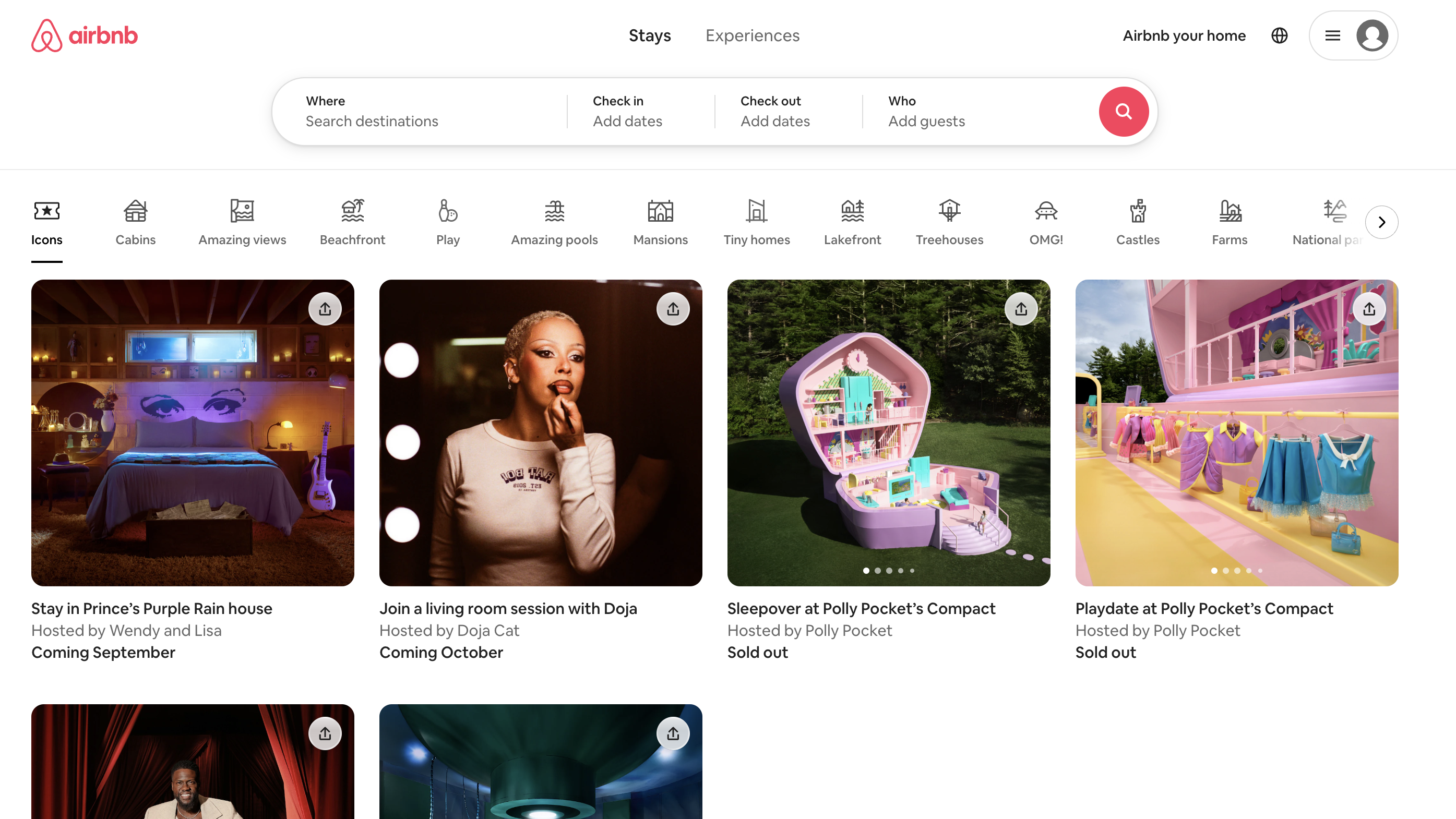
Screenshot 3
A Well-designed Button

I struggled on this one for a while because I had trouble defining what a "good" button is. I think the Airbnb one is certainly visually striking though, and I really like the subtle hover animation. It's also a much brighter color than its surroundings and stands out visually. The search icon adheres to convention and makes it easy to intuit what this button is meant for.

