Reva Hirave
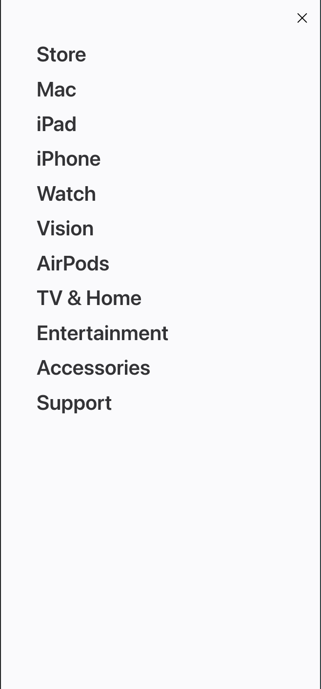
Screenshot 4
A Well-designed Mobile Navigation


Apple's home page on mobile is a great example of mobile navigation that is hidden behind a button. The main navigation is hidden behind a hamburger icon (three horizontal lines) on mobile, which is a standard and recognizable way to condense menus on small screens. Upon clicking the button, the menu slides out or expands to show a clean, vertically stacked list of options that are easy to tap, even on small screens. The hamburger icon is also frozen to the top of the page, even while the user scrolls, which makes it easy to navigate around the site.